Public spaces are essential parts of our daily lives, offering places to relax, socialize, and enjoy our surroundings. The success of these areas hinges on their design. To draw visitors and ensure they return, public spaces must be functional, accessible, user-friendly, and tailored to the community’s needs, adapting as those needs change. These spaces are meant to be used, not just admired.
Unfortunately, not all public space designs achieve these goals. When design fails, it can result in spaces that are confusing, impractical, or downright dangerous. Such blunders often leave people scratching their heads, wondering how these designs ever got approved.
These design mishaps are frequently shared online, where they can be critiqued by a global audience. “Nation-Post” has compiled a list of some of the most glaring examples of poor design in public spaces. From benches you can’t sit on to stairs that lead nowhere, these photos highlight the importance of thoughtful, user-centric design. They serve as a reminder that we deserve better from the spaces we use every day.
The secret to a great public space lies in its design. To attract visitors and ensure repeated use, these places must be functional, accessible, user-friendly, and meet the needs of the community, evolving as those needs change. After all, most things are created to be used, not just admired.
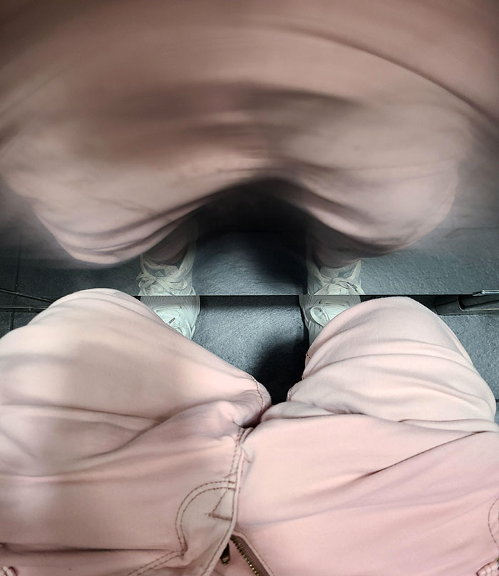
#1 How Close This Toilet Is To The Stall Door. Had A Good Laugh At How My Feet Poke Out Underneath
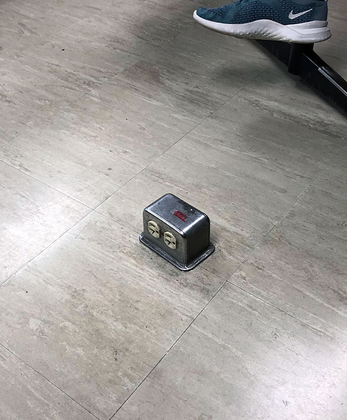
#2 My Classroom Has These Floor Outlets. It’s Basically The Toe Stubber 5000
#3 This Pattern On The Hospital’s Floor
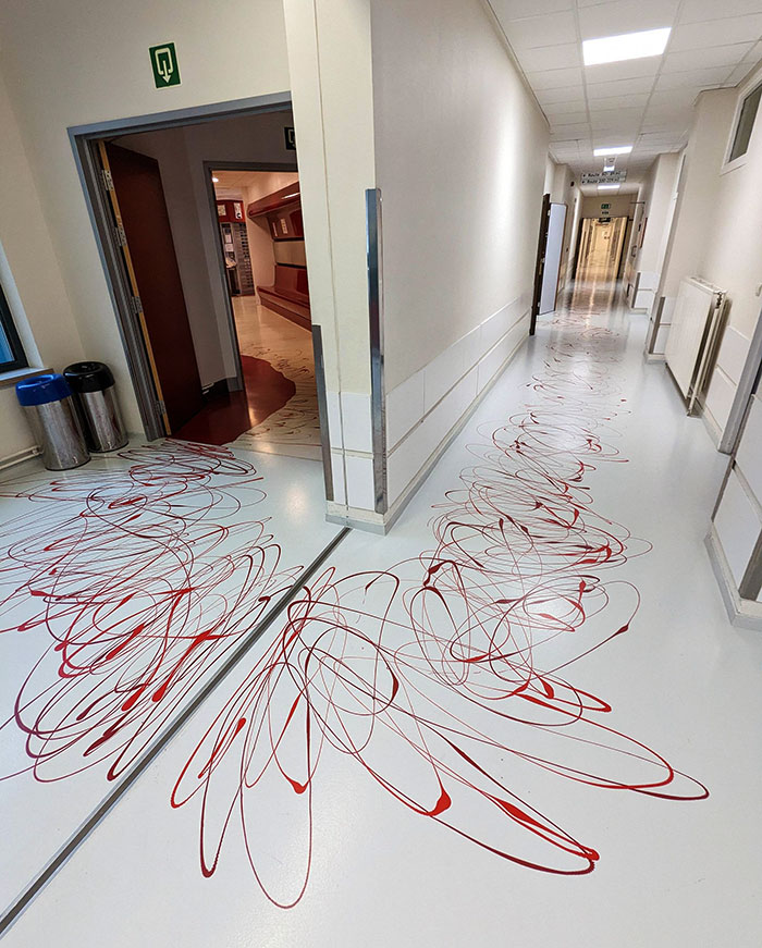
Such a design can be problematic for several reasons. Firstly, it can cause confusion and anxiety among visitors and staff. In an emergency situation where someone is actually bleeding and requires urgent assistance, these red patterns could make it difficult to discern real blood from the decorative design, potentially delaying the response time of medical personnel. Additionally, this could create a sense of unease and distress for patients and visitors, especially in a setting where cleanliness and hygiene are paramount.
Effective design in public spaces, particularly in healthcare environments, should prioritize clarity, functionality, and the psychological comfort of its users. This floor pattern, while perhaps intended to be artistic or unique, fails to meet these essential criteria and highlights the importance of thoughtful, practical design in places where people’s well-being is a top priority.
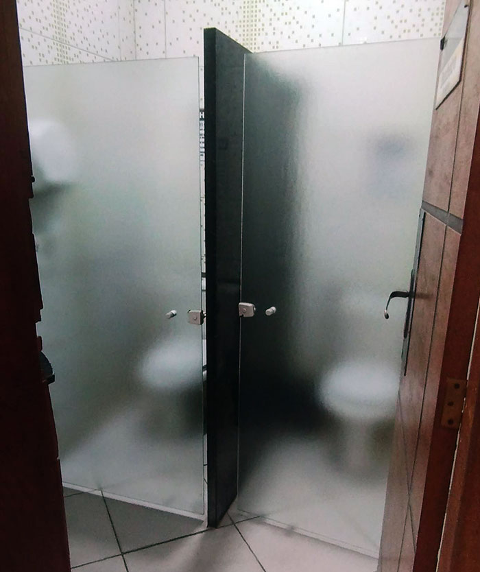
#4 The Students In My Course Complained About Not Having Enough Privacy, And University Decided To Install Glass Doors To Solve The Issue
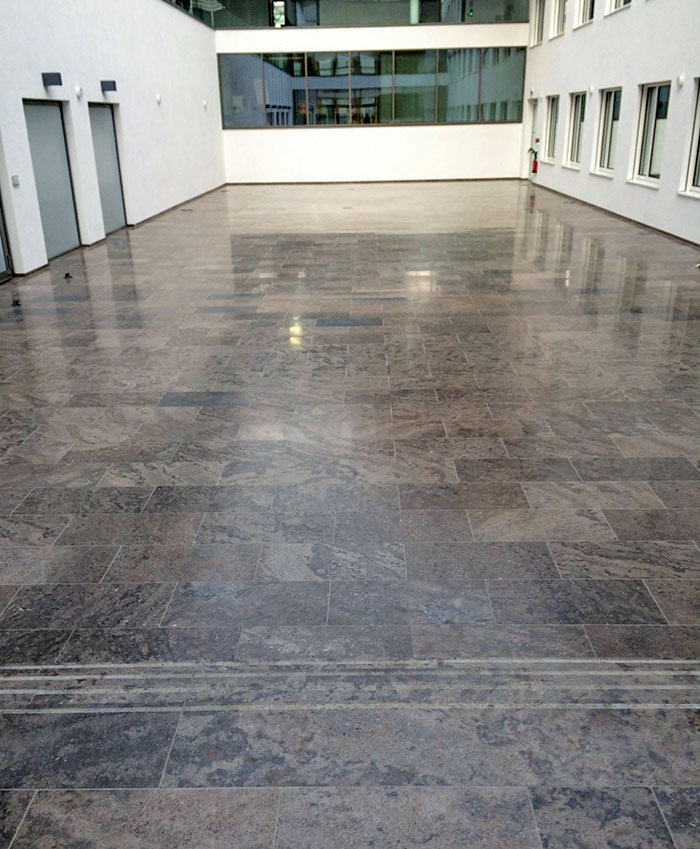
#5 There Are Three Steps Down At The Entrance To This Lobby
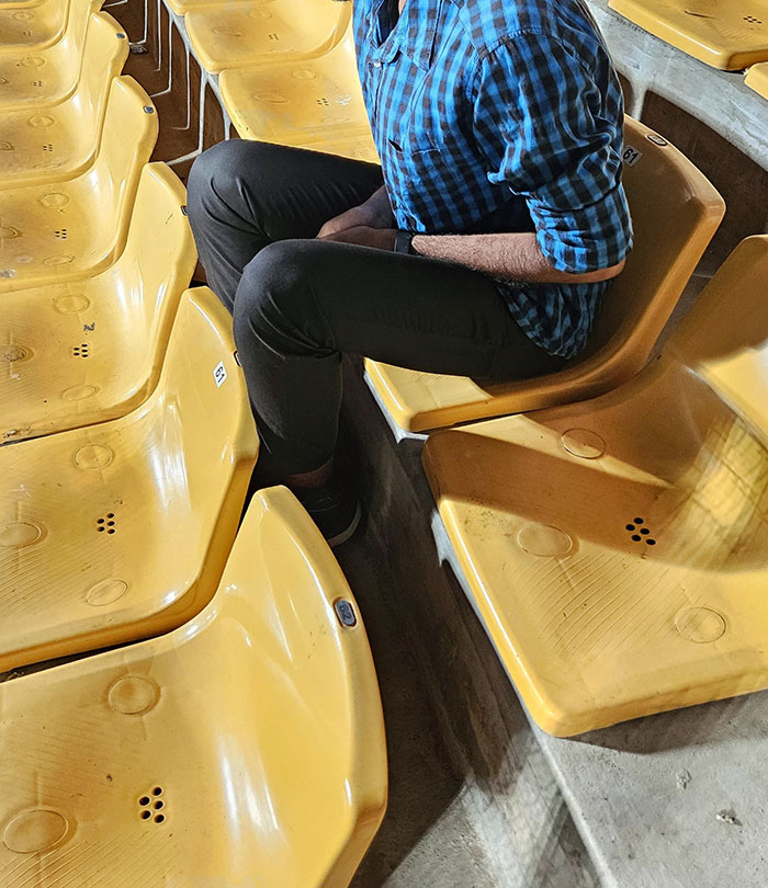
#6 Leg Space In A Cricket Stadium
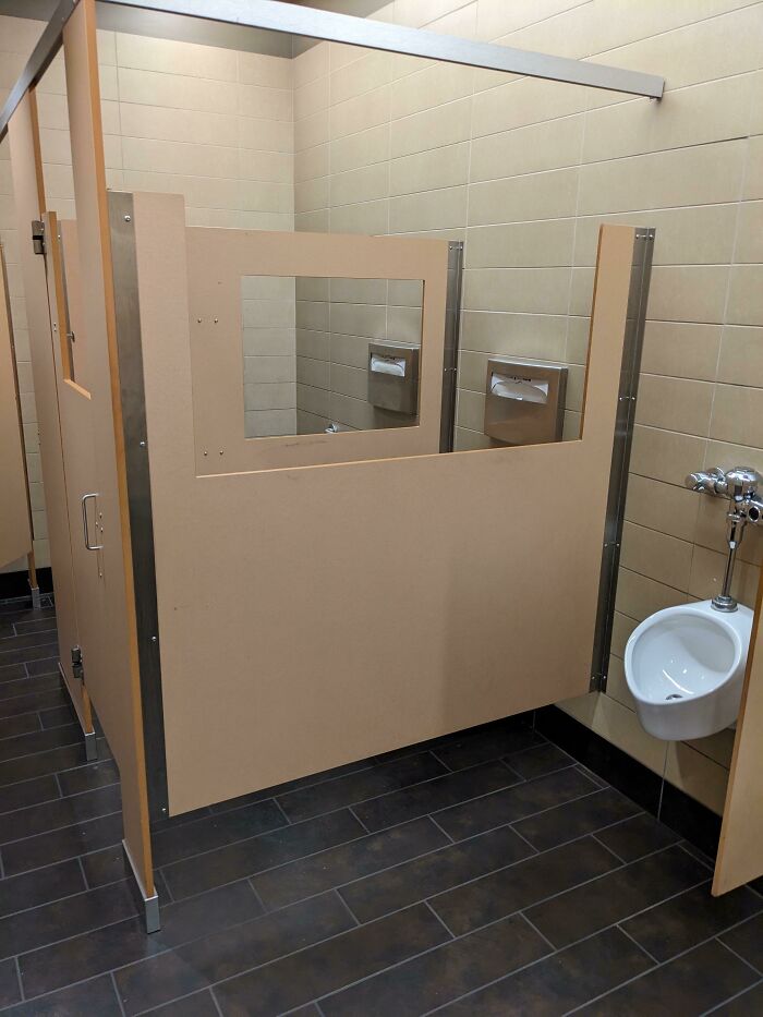
#7 Public Restroom Stalls With… Viewing Windows? Why?
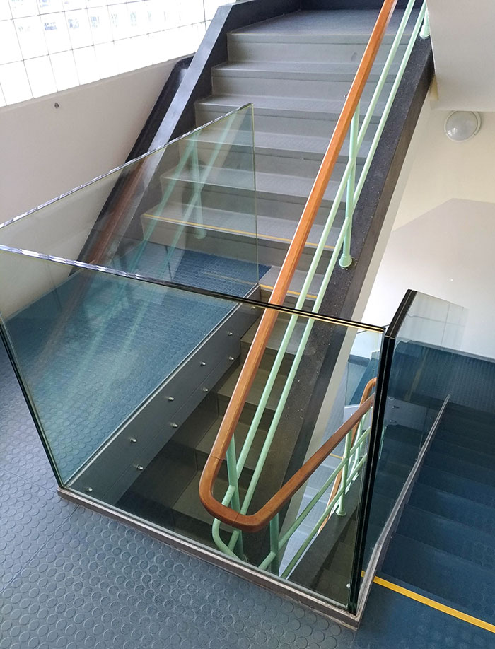
#8 These Stairs
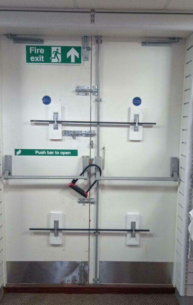
#9 Lets Hope There Won’t Be Fire
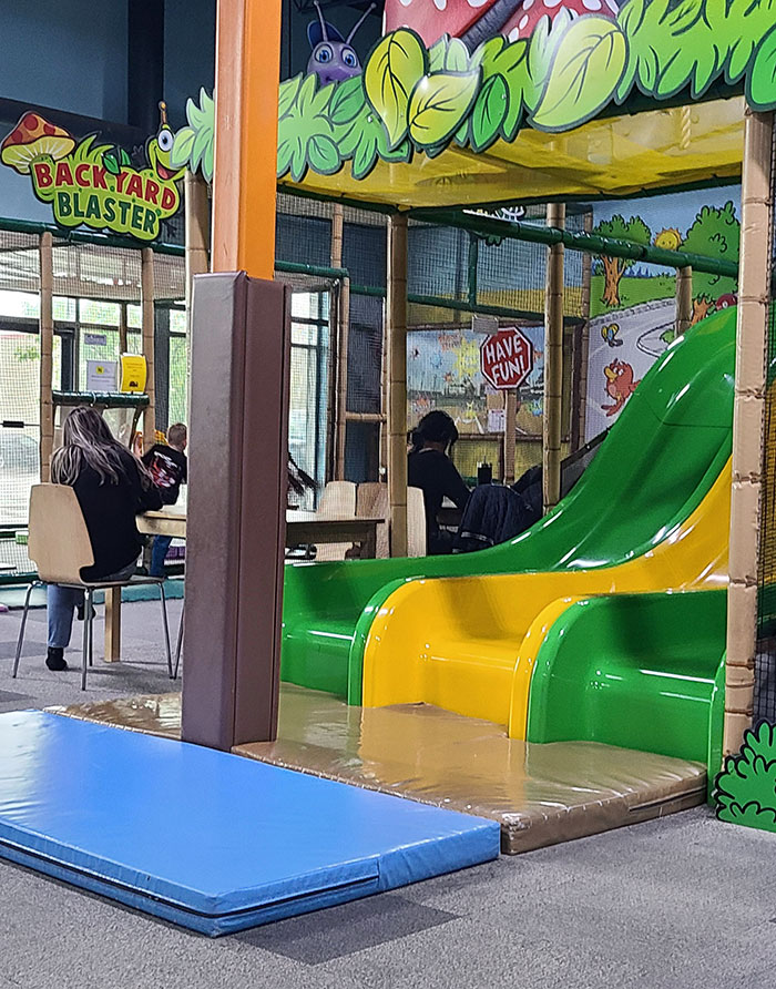
#10 At Least It’s Padded
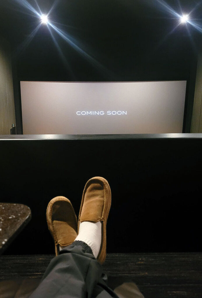
#11 My View At A Movie Theater Last Night
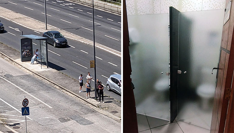
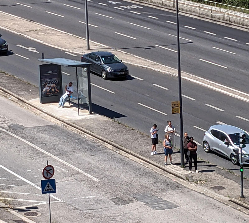
#12 The bench/shelter is 8m away from the actual bus stop.
However, not all designs meet these criteria. What happens when they fail? They are shared online for netizens to judge. We compiled some of the worst cases in the list below. We hope these photos serve as a public service announcement that we deserve better!
These epic design fails offer more than just a laugh; they underscore the critical need for planners and designers to prioritize functionality and accessibility. By learning from these mistakes, we can strive to create public spaces that truly serve the communities they are meant for, enhancing the quality of life for everyone who uses them.